Brand color palette
Accion’s color palette brings visual interest to our communications, helps maintain a consistent look and feel, and differentiates us from other organizations.
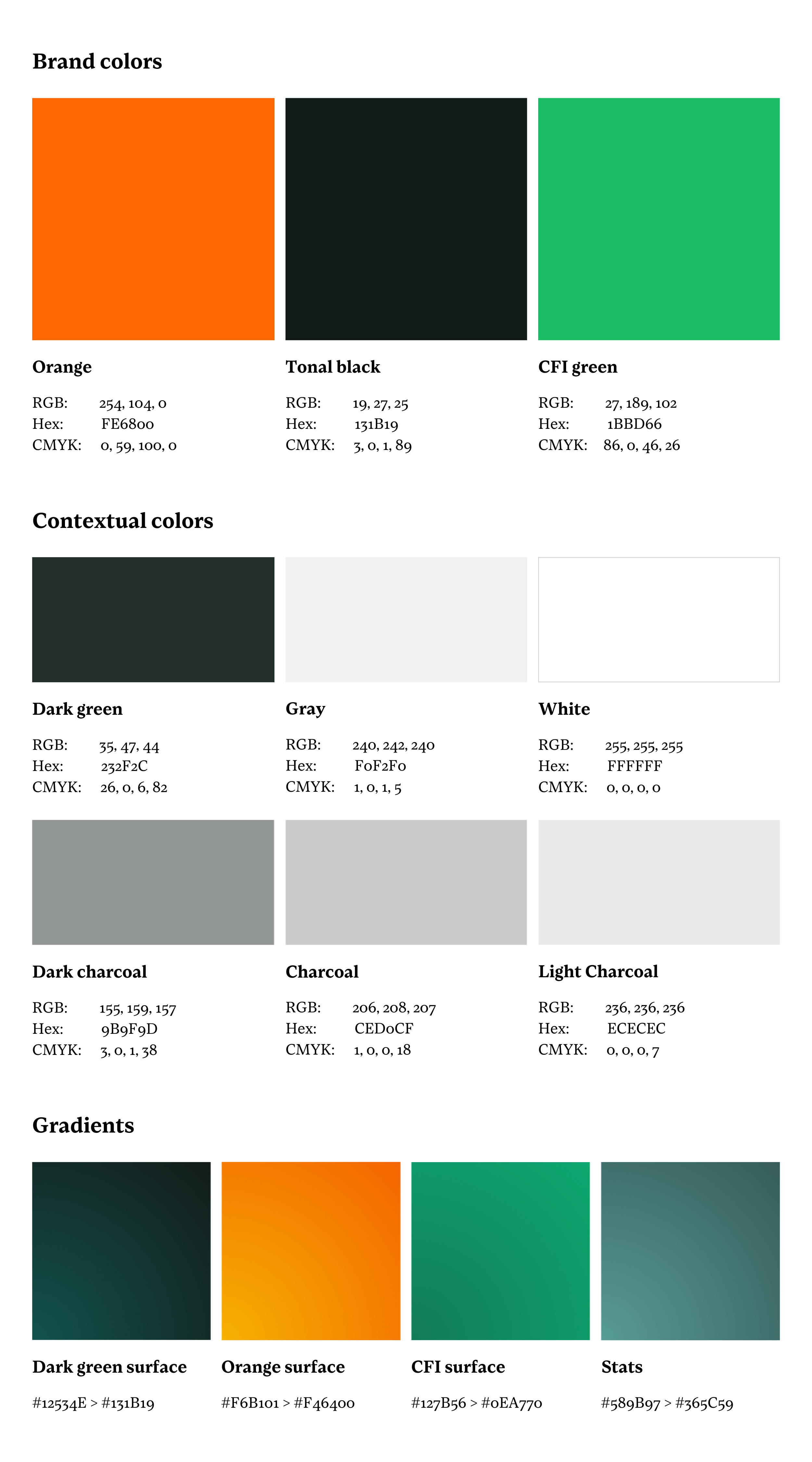
For information on how to use Accion’s gradients, visit the Patterns & Icons section of this Style Guide.
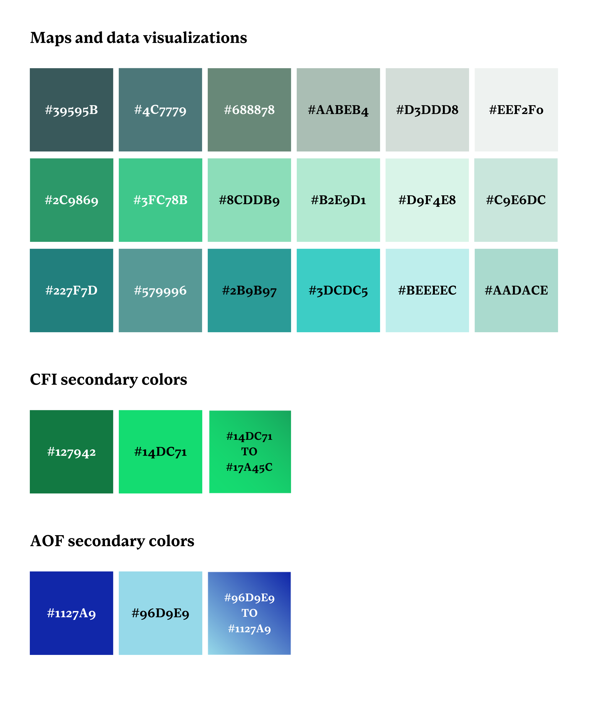
Accent colors
An expanded color palette is available for use with data visualizations and other graphics. These colors should be used sparingly and not as primary brand colors. For details on how to use Accion’s accent colors in maps and data visualizations, visit the Data Visualization section of this Style Guide.
Print colors
If printing a full-color design containing items such as photos or gradients, then CMYK (listed above with Accion’s core colors) is preferred.